During the early ’20s to late ’40s, books on showcard writing and hand lettering were fairly common. Unfortunately, the demand for hand lettering has lessened and finding good basic tutorials is difficult.
The images in this section are from a 1942 book by C.R. Havighorst called Simplified Show Card Writing.
Part 1: Basic Strokes
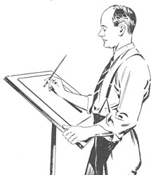
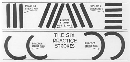
Practice, practice, practice! Unfortunately, there is no magical wand here. You just have to put down thousands of strokes. The above group gets you started with the six basic practice strokes. The image at the top of the page illustrates how to hold the brush for show card writing.
Practice each stroke side by side about 60 times, then move to the next one.
Circles and “O”s require two elements shown above and below. For the basic gothic letterstyle, the brush is twisted in the fingertips to keep the chisel point of the brush at the correct angle.
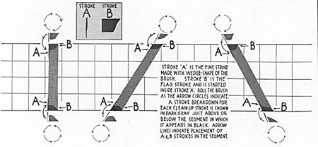
Besides the basic strokes shown in the top section, another group of strokes called “clean up strokes” must be perfected to complete a basic gothic alphabet. As the stroke is pulled, the brush is twisted in the fingers to create the “B” stroke in the gray box at the top of this image.
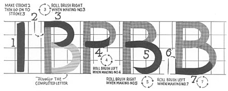
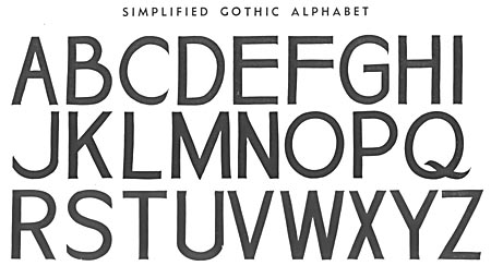
Once you master the basic strokes and clean up strokes, you will be able to assemble complete letters as shown below.
The Basic Gothic Alphabet: Using strokes shown above, this set of letters can be easily achieved.
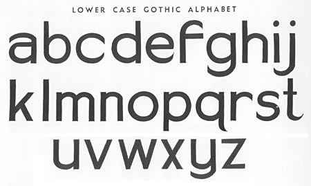
Numbers and punctuation are also created using the same set of basic strokes. Practice, practice, practice!
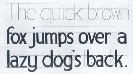
In laying out a show card, first rule the guide lines as shown. Then rough in your copy lightly with a soft pencil or charcoal stick. If the spacing is not exactly right you can easily adjust this when you do the actual lettering, as shown in the third line of copy above.
Basics of Italic and Script Lettering Strokes
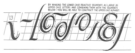
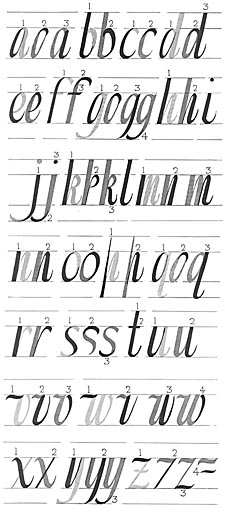
Once you have mastered the basic strokes needed in basic gothic lettering, the strokes needed for italics and script lettering will be much easier to learn.
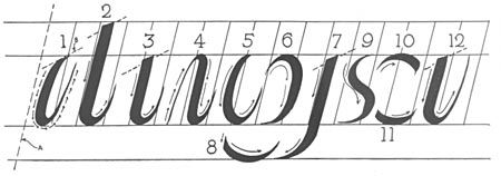
Instead of twisting the brush, as executed when making basic gothic lettering, the chiseled tip of the brush is maintained a close to a 45 degree angle.
The strokes shown in the two plates above cover most of the ones you will need for italic and script letterstyles.
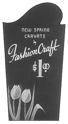
C.R. Havighorst lettered this nice show card using a bouncy script of the times. Italics and scripts share many of the same characteristics and strokes.

